As this is a completely new Mega Menu, if you have any installation issues, please contact our support team for answers: https://arenathemes.freshdesk.com/support/tickets/new
How to setup Mega Navigation
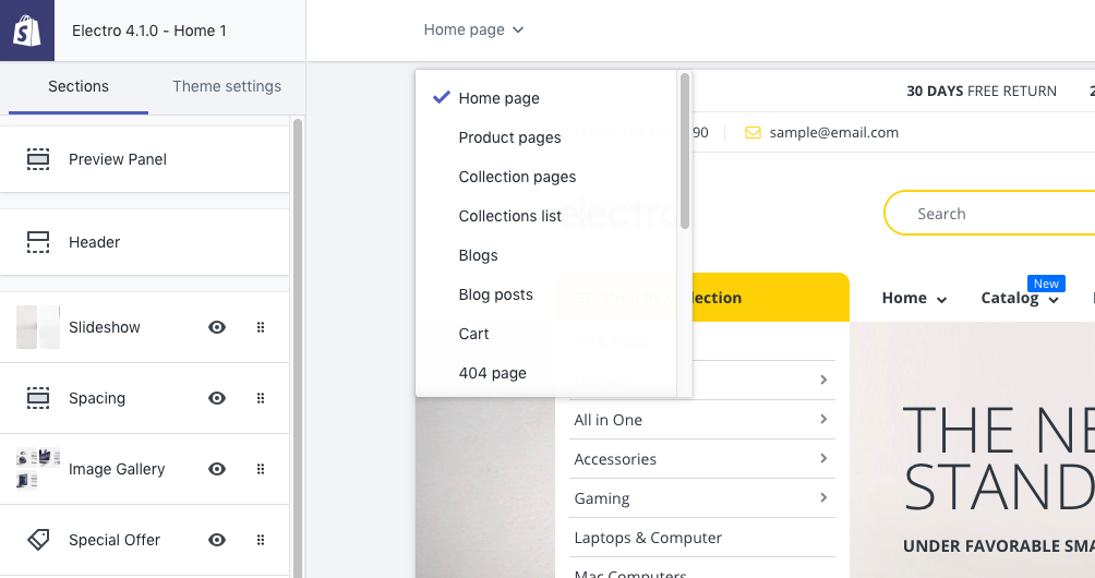
From your Shopify admin, go to Online Store > Themes
Find the theme that you want to edit and click Customize
From the top bar drop-down menu, Select Home Page
Select Header Section
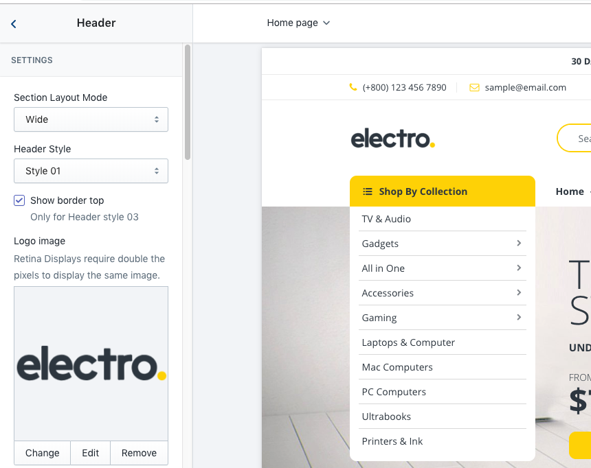
Scoll down to Main Menu & Vertical Menu. Click & select Main menu & Verticle Menu for your website. If you dont know how to creat a menu you can follow instruction
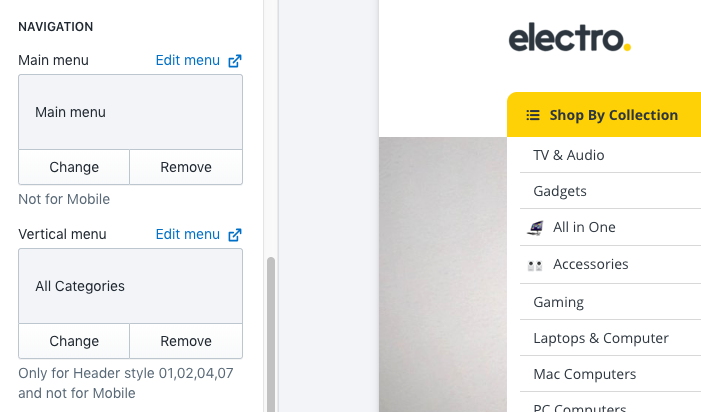
- Enable Mega Menu
- Menu Flyout Left: Catch handle navigation to flyout left
ADD MEGA NAVIGATION
- Click Add Content and Select type of navigation
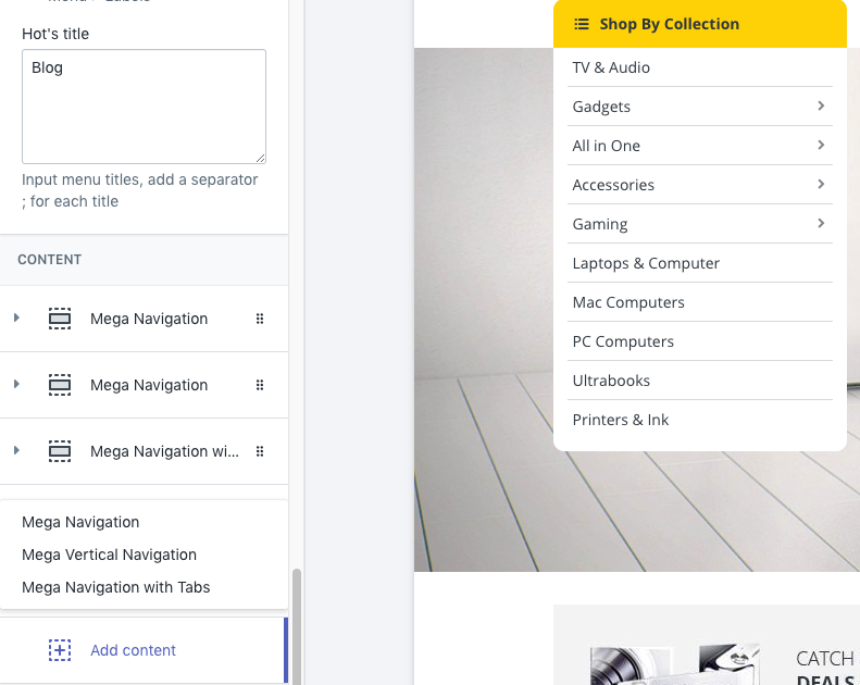
The theme support 3 type of Mega navigation styles:
- Horizontal Mega Navagation (aka Mega Navigation)
- Vertical Mega Navigation
- Mega Navigation with Tabs
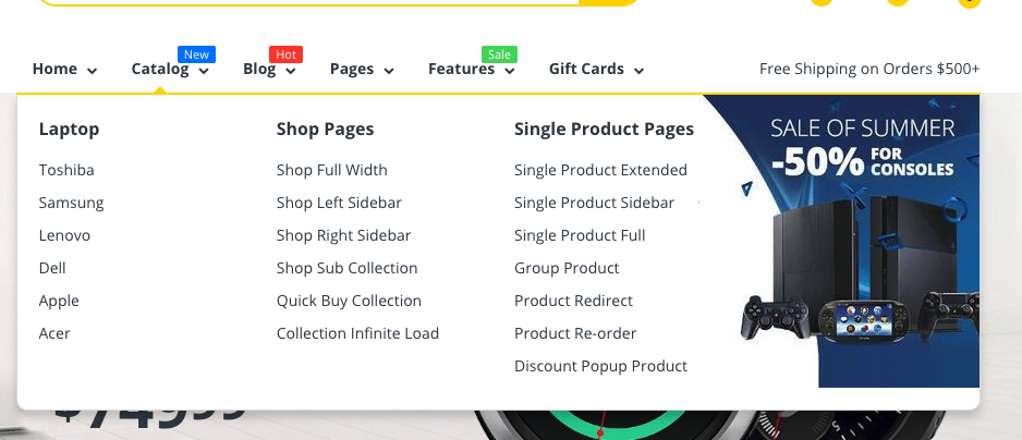
Add Horizontal Mega Navigation Content (Mega Navigation)
- Mega Navigation will show in 1 block (1 row - 4 columns).
- Layout: 12 gird layout system. https://getbootstrap.com/docs/4.0/layout/grid/
Settings
LAYOUT
Mega navigation trigger: Add the title of the menu that you want to turn into a mega-nav
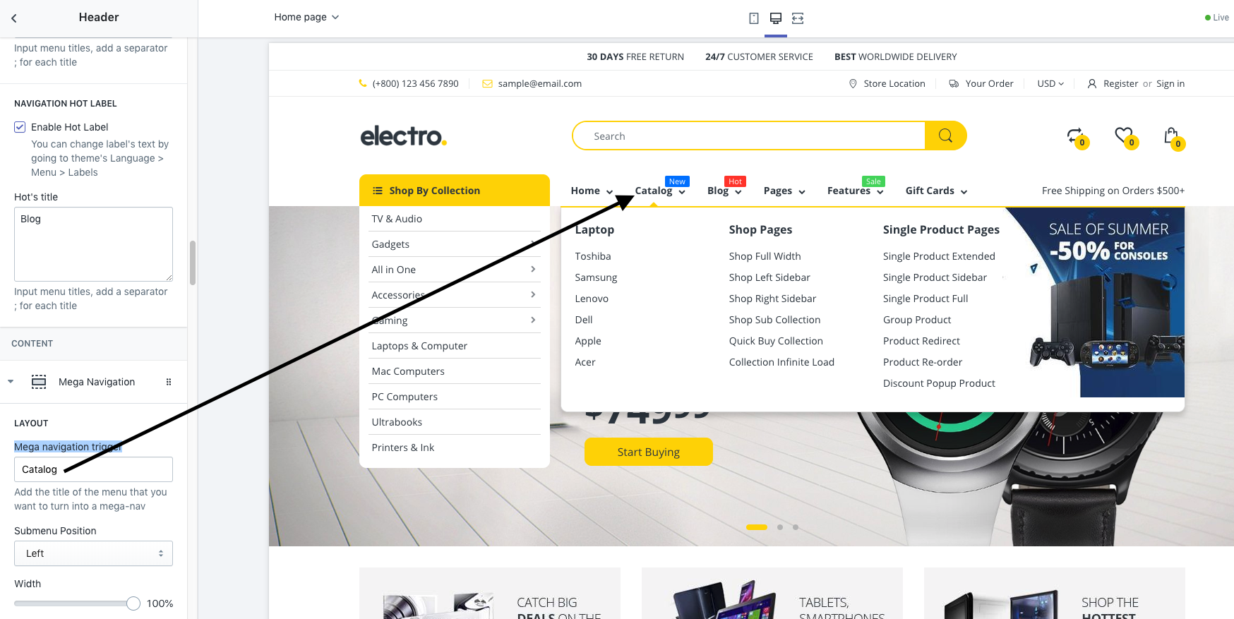
Submenu Position: Set position for your submenu (left, right, or center)
- Width (Mega Navigation Width): Percentage when compared to Main Menu block.
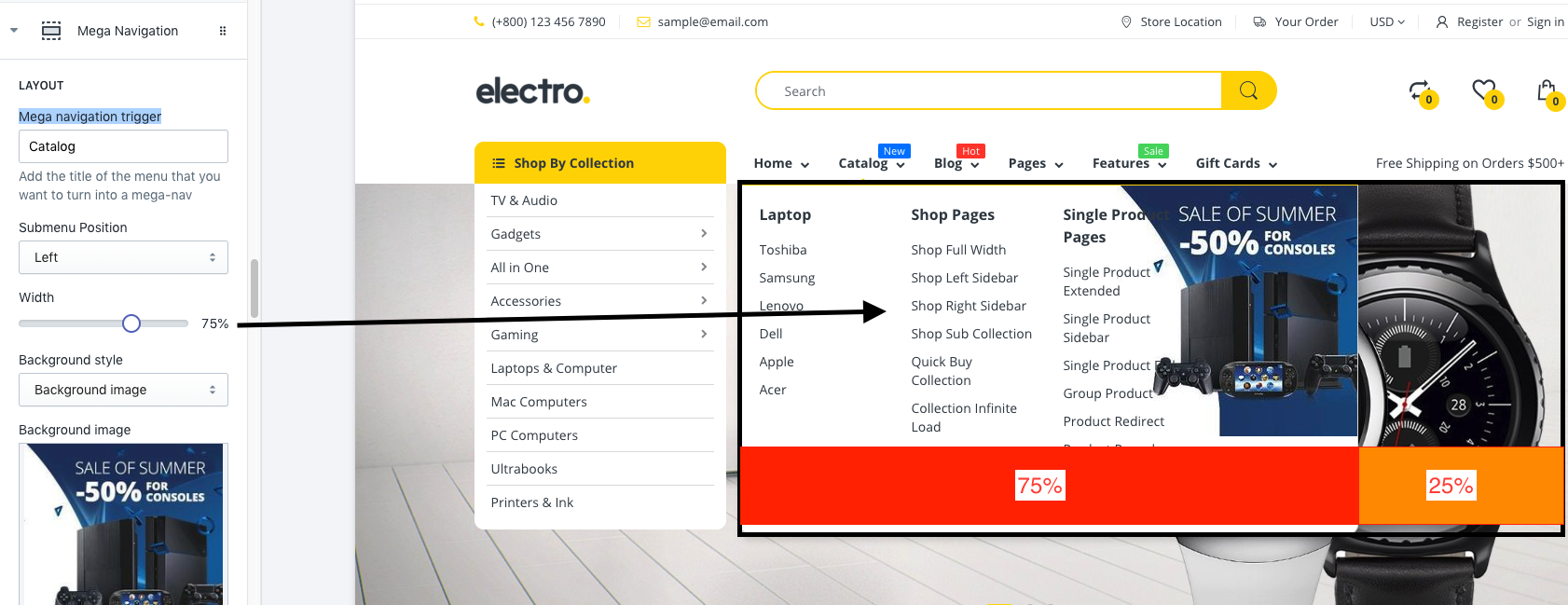
- Background style: Select background for your Mega Navigation content
- Background image: Set background image
- Image size: Set Background image size
- Background image position: Background image position
- Background color
- Min height (unit px): Set minimum height of Mega Navigation. You can adjust the height based on the content inside to cover it
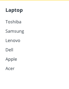
COLUMN 01 - COLUMN 4: Select Component to display as each column.
Content Components: The theme support 7 component types
- Menu item: Navigation list
- Multiple menu items: Add multi menu items at 1 column

- Product: select product to display, we support 2 product to display at one column.
- Collection: display product in one collection as slider
- Menu item & Product: Combine Menu item & Product
- Image: Show one image at column.
- None: Display nothing. This column is off.
- Heading: Heading title in Column.
- Only enable the column's heading on Mobile
- Link to
- Width: It supports to select width of component column. If you select auto column width, the content of the column will be automatically calculated.The 1/12 ratio means that the width is one-twelfth of the Mega Navigation Width. Please note that The total width of the 4 columns component must not exceed 12.
- Eg. Auto - Auto - Auto - Auto: It's will fix 4 columns at same width
- Eg. 2/12 - 4/12 - 3/12 - 3/12
- The following settings will be used for each of the above components.
- Eg: Menu item -> Use for Menu item & Multi Menu items
- Product: -> Product component
- Collection -> Collection component
- Image -> Image component
- You can config up to 4 columns.
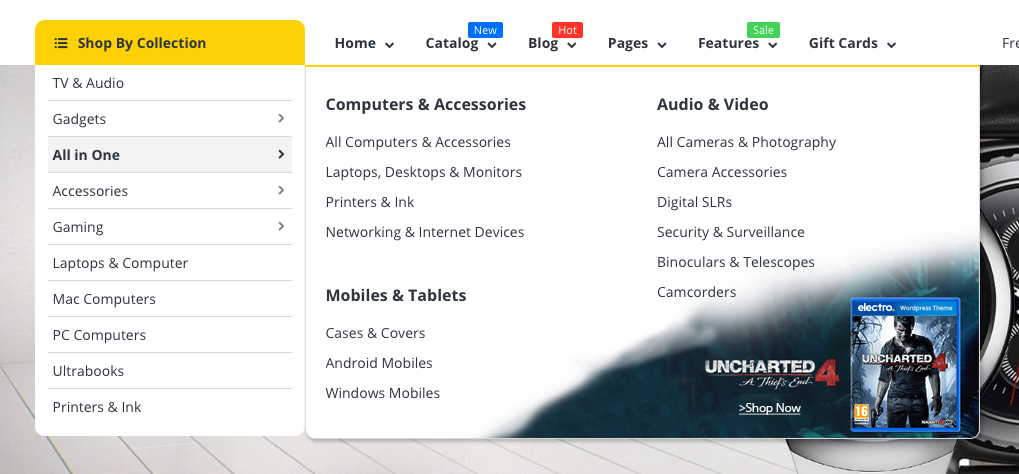
Add Vertical Mega Navagation Content
Pretty similar to Horizontal Mega Navigation, except it only supports 3 columns
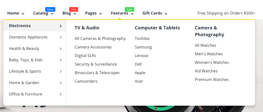
Mega Navigation with Tab
Most settings will be similar to other mega navigation content types. However due to the large amount of content, you will need to config more.
- The theme support total 7 tabs, each tab contain 4 columns. Columns Content only support 4 components:
- Menu item
- Multi menu item
- Image
- None.
- Tick Show Tab 01 to display tab 1.
- Tab Heading: Display Tab Heading