As this is a completely new Mega Menu, if you have any installation issues, please contact our support team for answers: https://arenathemes.freshdesk.com/support/tickets/new
How to setup Mega Navigation
From your Shopify admin, go to Online Store > Themes
Find the theme that you want to edit and click Customize
From the top bar drop-down menu, Select Home Page
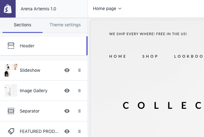
- Select Header Section

- Scoll down to Main Menu & Vertical Menu (hamberger icon click to show verticle header support Header style 2). Click & select Main menu & Verticle Menu for your website. If you dont know how to creat a menu you can follow instruction https://help.shopify.com/en/manual/sell-online/online-store/menus-and-links/editing-menus#add-a-menu-item.

- You may setting Position Menu for Header Style 1,3,10
- Enable Mega Navigation: Show Mega Navigation content will setting at CONTENT block below
- Menu Flyout Left: Catch handle navigation to flyout left
ADD MEGA NAVIGATION
- Click Add Content and Select type of navigation
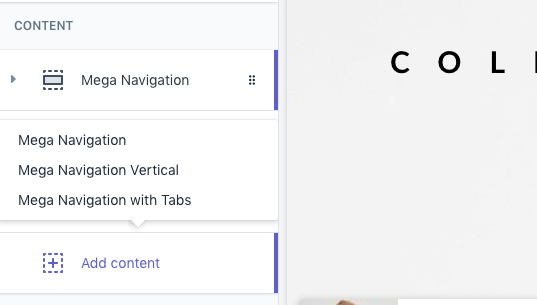
The theme support 3 type of Mega navigation styles.

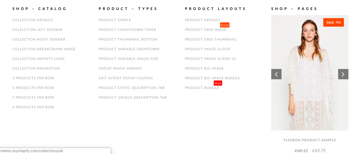
- Horizontal Mega Navagation (aka Mega Navigation)
- Vertical Mega Navigation
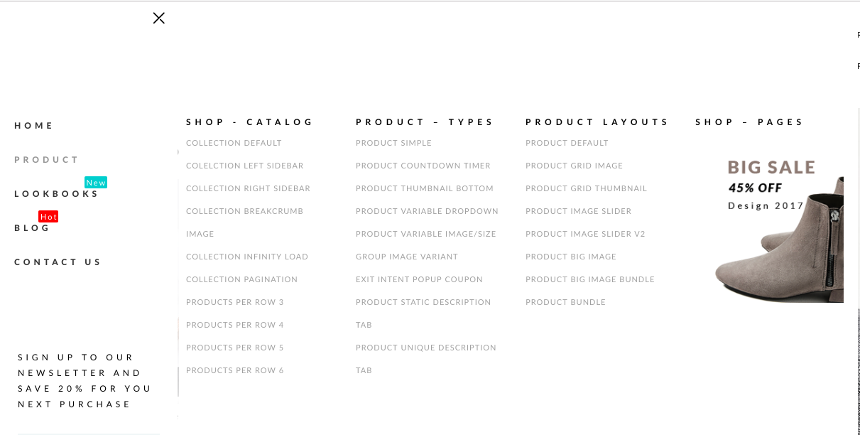
- Mega Navigation with Tab
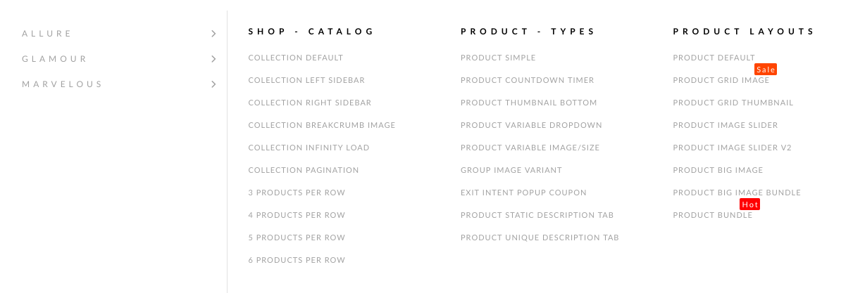
Add Horizontal Mega Navigation Content (Mega Navigation)
- Mega Navigation will show in 1 block (1 row - 4 columns).
- Layout: 12 gird layout system. https://getbootstrap.com/docs/4.0/layout/grid/
Settings
- LAYOUT
- Mega navigation trigger: Add the title of the menu that you want to turn into a mega-nav
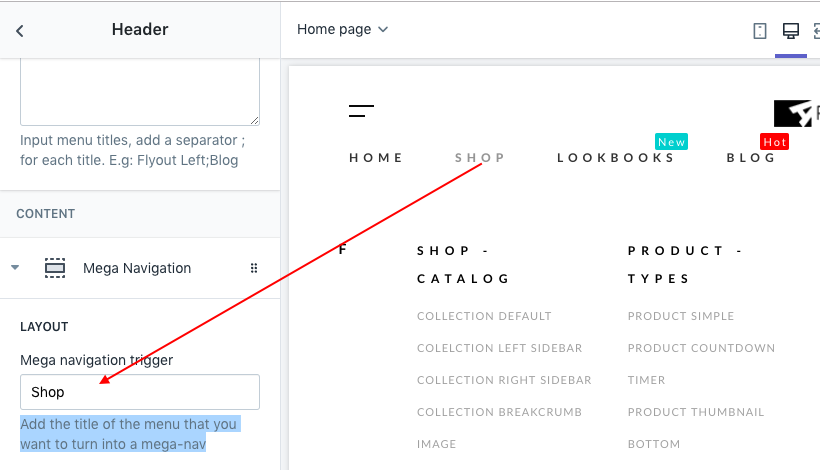
- Width (Mega Navigation Width): Percentage when compared to Main Menu block.

- Background type: Select background for your Mega Navigation content
- Background image: Set background image
- Image size: Set Background image size
- Background image position: Background image position
- Background color
- Min height (unit px): Set minimum height of Mega Navigation. You can adjust the height based on the content inside to cover it
- COLUMN 01 - COLUMN 4: Select Component to display as each column.
- Content Components: The theme support 7 component type
- Menu item: Navigation list
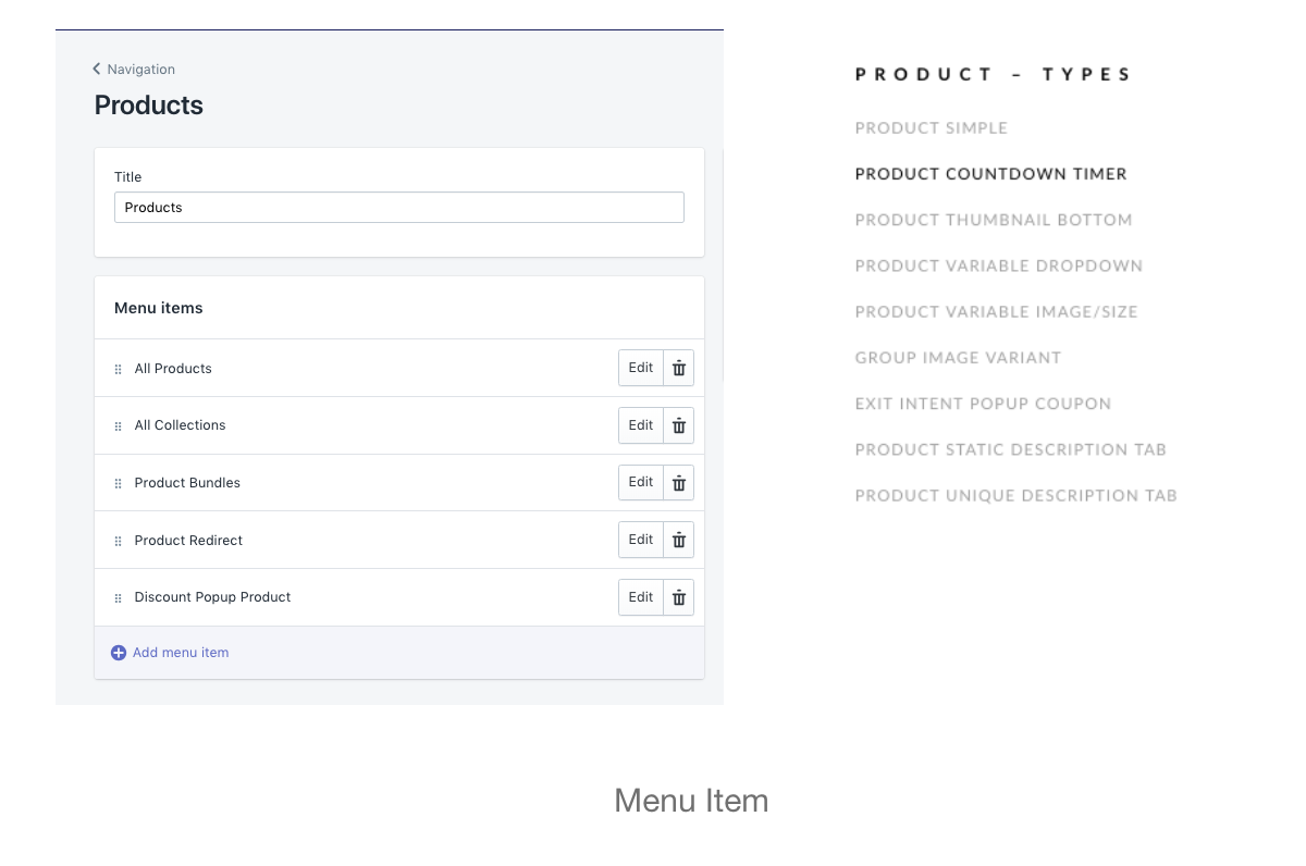 *
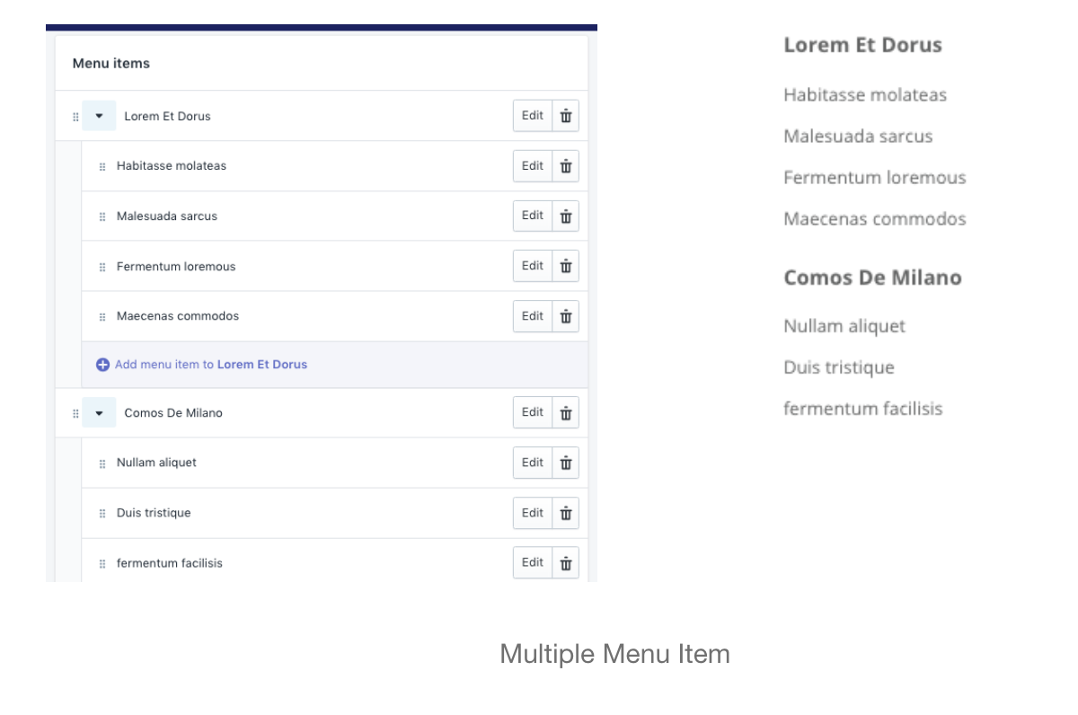
* - Multiple menu items: Add multi menu items at 1 column
- Product: select product to display, we support 2 product to display at one column.
- Collection: display product in one collection as slider
- Menu item & Product: Combine Menu item & Product
- Image: Show one image at column.
- None: Display white space at column
- Menu item: Navigation list
- Heading: Heading title in Column.
- Only enable the column's heading on Mobile
- Link to
- Width: It's support to select width of component column. If you select auto column width, the content of the column will be automatically calculated.The 1/12 ratio means that the width is one-twelfth of the Mega Navigation Width. Please note that The total witdh of the 4 columns component must not exceed 12.
- Eg. Auto - Auto - Auto - Auto: It's will fix 4 columns at same width
- Eg. 2/12 - 4/12 - 3/12 - 3/12
- The following settings will be used for each of the above components.
- Eg: Menu item -> Use for Menu item & Multi Menu items
- Product: -> Product component
- Collection -> Collection component
- Image -> Image component
- You can settings for total 4 columns
Add Vertical Mega Navagation Content
- Content Components: The theme support 7 component type
Similar to Horizontal Mega Navigation
Mega Navigation with Tab
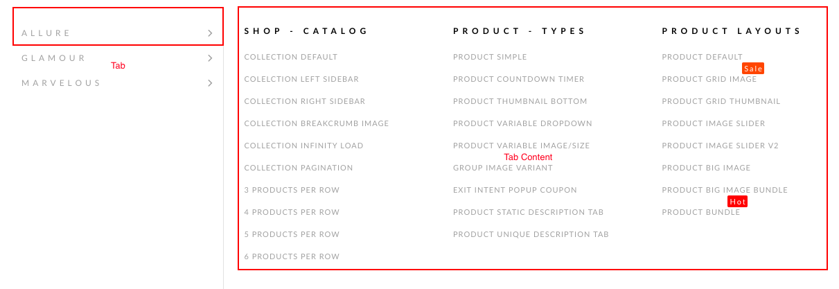 Most settings will be similar to other mega navigation content types. However due to the large amount of content, so you will need to settings more.
- The theme support total 7 tabs, each tab contain 4 columns. Columns Content only support 4 components:
- Menu item
- Multi menu item
- Image
- None.
- Tick Show Tab 01 to display tab 1.
- Tab Heading: Display Tab Heading, as you can see in demo is ALLURE